A Taste of the
Mediterranean.
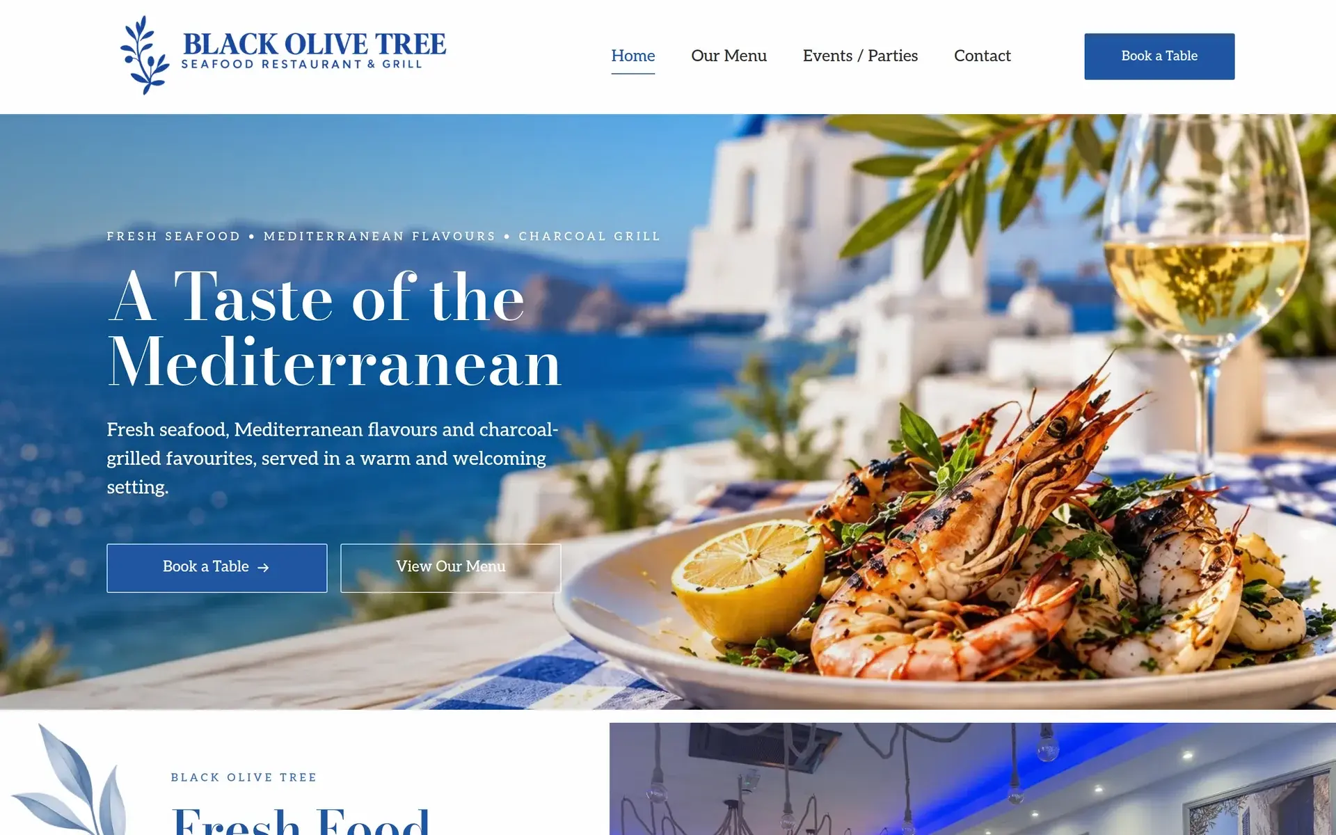
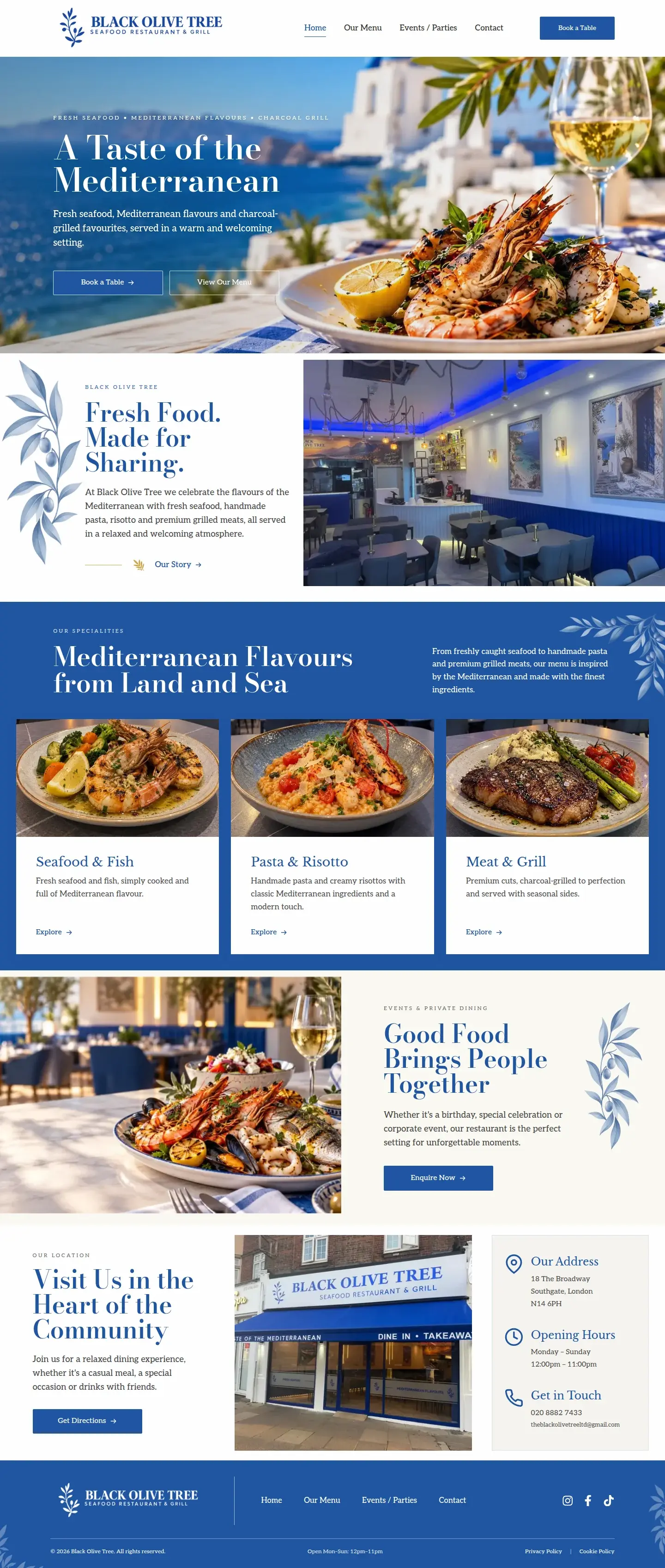
Black Olive Tree in Southgate relaunched as a modern Mediterranean seafood & grill - new name, new menu, new identity. We rebuilt their website around the new brand: a pixel-matched home page, a menu designed like the printed one, and a site that holds up just as well on a phone.
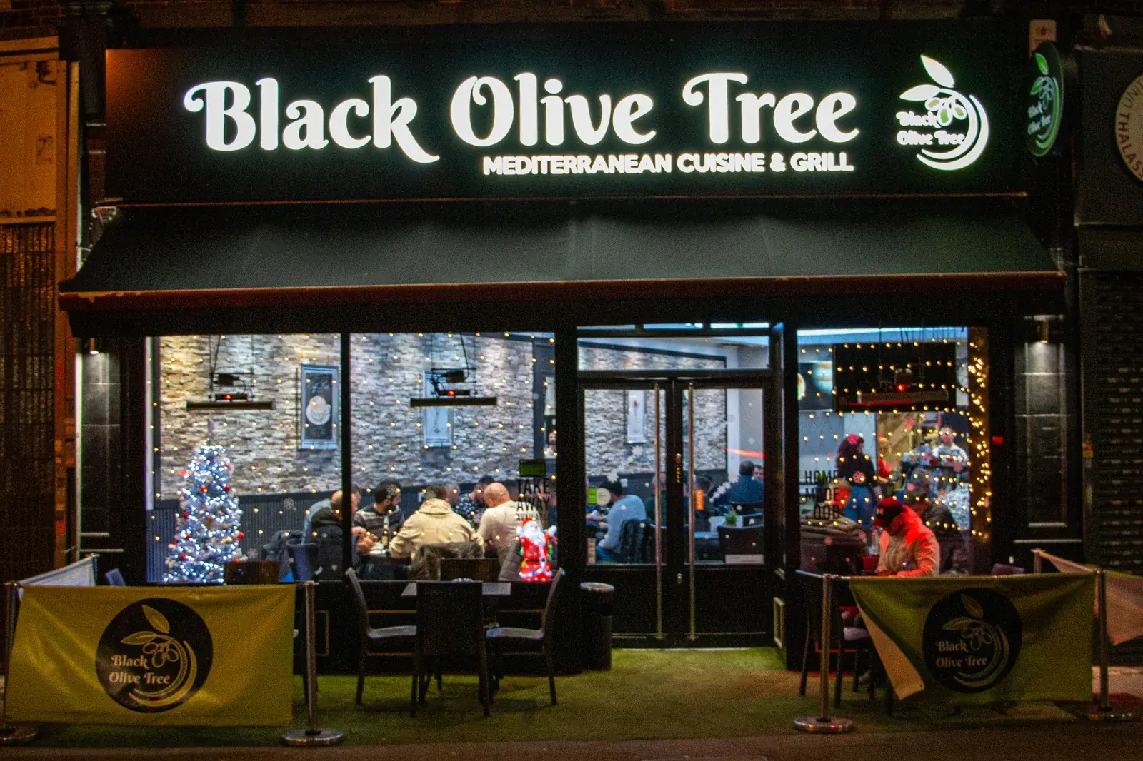
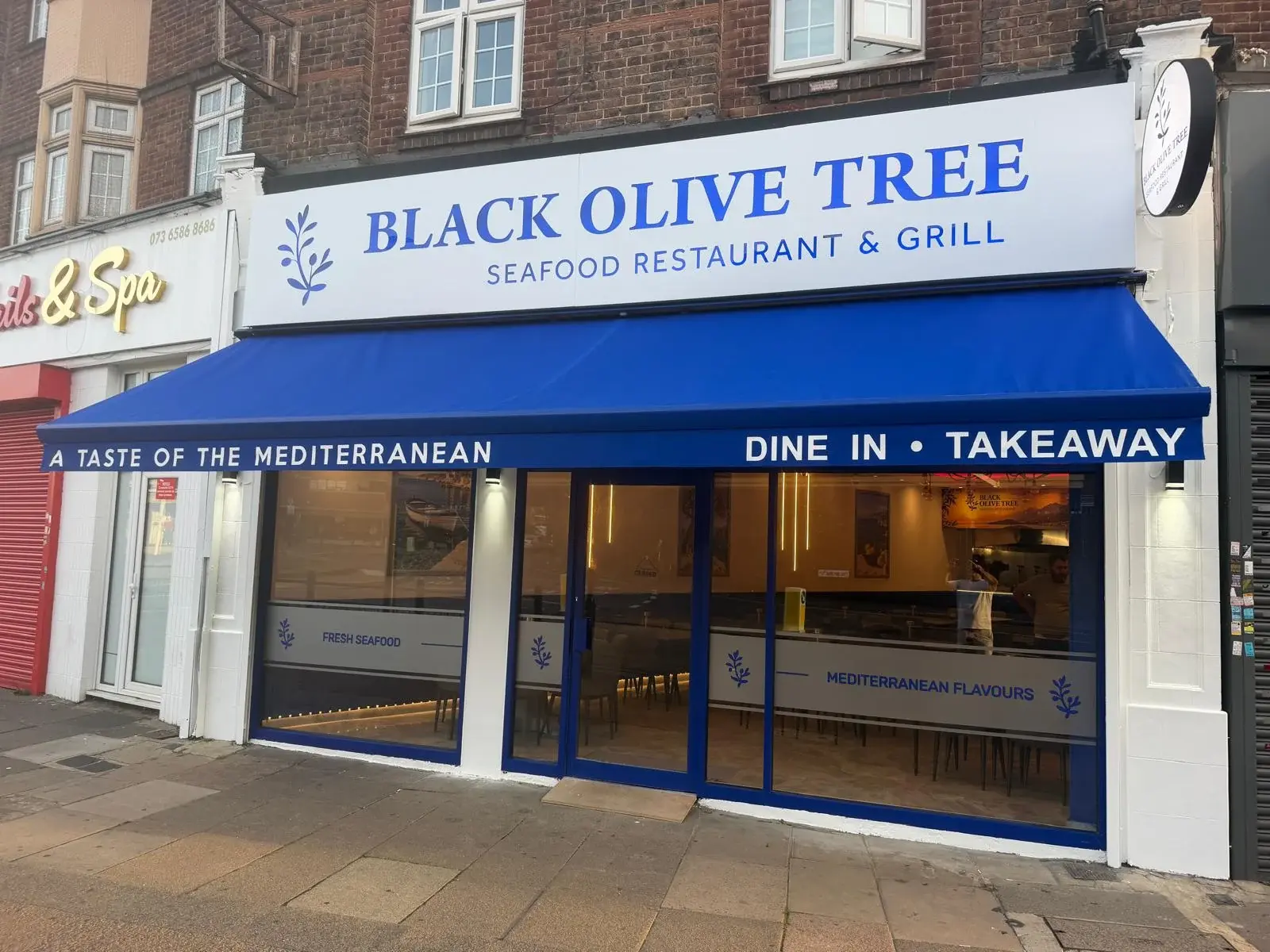
Same Spot.
New Restaurant.
The old site sold a green-branded Mediterranean grill. The new Black Olive Tree is blue and white, coastal and premium - grilled octopus, lobster risotto, tomahawk steak, seafood platters for four. We were handed a home page mockup, a style guide, a logo PDF, a new menu and a copy brief, and asked to make the whole site match.
Match the Mockup
Layout, type and spacing measured from the design - not approximated.
A New Menu
Eight sections transcribed from the printed PDF and styled to match it.
New Logos Everywhere
Transparent blue and white logo sets extracted straight from the brand PDF.
Great on a Phone
Every page verified at phone and desktop widths before it shipped.

Built to the
Mockup.
We measured the designer's mockup and rebuilt it as a fluid layout - margins, columns, type sizes and weights expressed as fractions of the screen, so it looks like the design at 1440px and still holds together at 1920 or on a laptop. Bodoni Moda, Libre Baskerville and Aleo, straight from the style guide.
Measured, Not Eyeballed
Section heights, image insets and the leaf decorations sit where the mockup puts them - the rendered page is within 1% of the design's proportions.
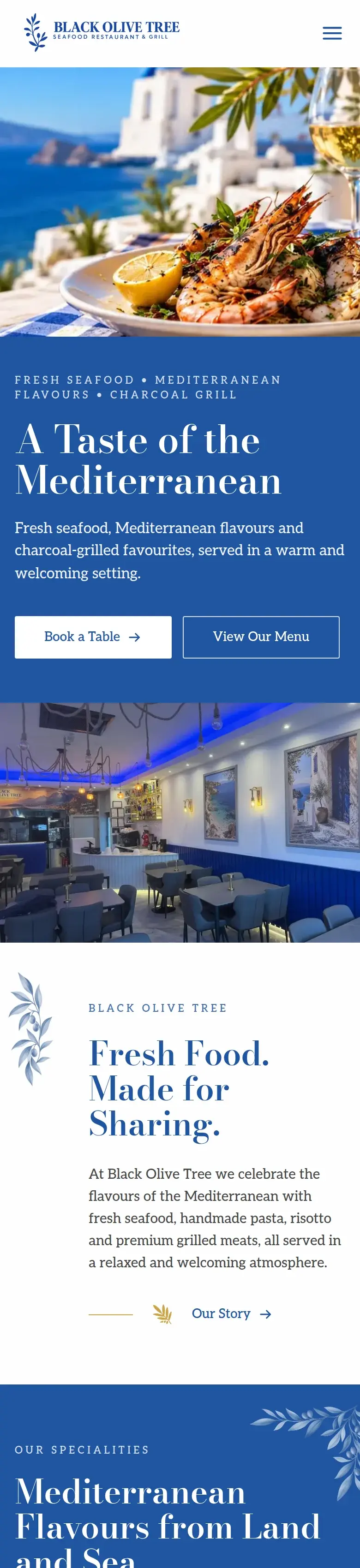
A Different Hero on Mobile
Text over the plate wasn't readable on a phone, so below tablet width the hero stacks: photo on top, copy on a solid brand-blue panel.
Photos Cropped for the Slot
Dish photos are pre-cropped to each card's exact aspect ratio with the plate prioritised, so nothing important is ever cut off.
The Printed Menu,
Online.
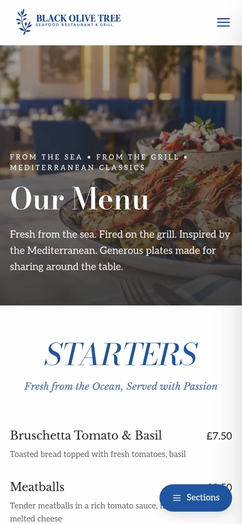
The restaurant had a beautifully typeset new menu in print. Rather than dump it into a generic list, we rebuilt its look on the web: italic Bodoni section titles, two columns with a hairline divider, and the boxed “To Share” platters - every section, item and price transcribed from the PDF.
Eight Sections, One Data File
Starters through desserts live in a single typed data file - a price change is a one-line edit, no design knowledge needed.
Jump to Any Section
A sticky table of contents on desktop and a floating 'Sections' panel on mobile take you straight to Seafood & Fish or Meat & Grill.
Deep-Linked from the Home Page
The three speciality cards on the home page land you on the matching section of the menu.

The
Verdict.
Black Olive Tree's website now says the same thing as its new sign: modern Mediterranean seafood and grill. The home page is the designer's mockup made real, the menu page looks like the one on the table, the new logo is everywhere from the favicon to the cookie banner, and the whole thing is a static site on Cloudflare's edge - fast, cheap to run, and easy to update when the menu changes.

Rebranding your restaurant?
Hand us the mockup, the menu and the logo - we'll make the website match, down to the pixel, and make sure it works on every phone in the dining room.
Start Your Project