Zero Sugar,
Full Volume.
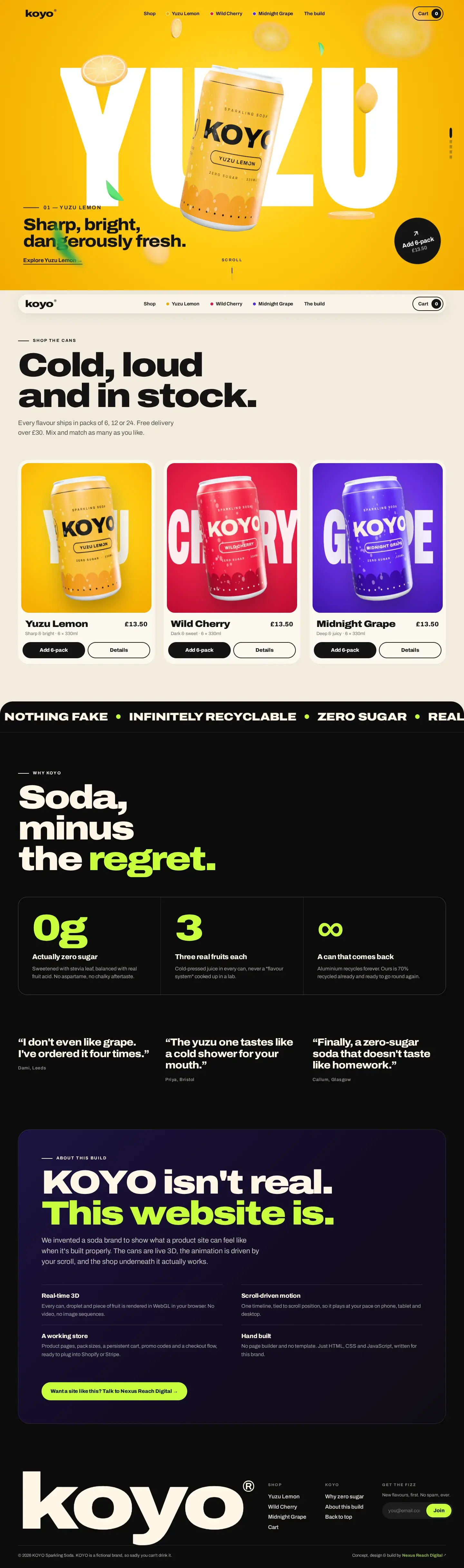
KOYO is a sparkling soda brand we created from a blank page - name, cans, colours and copy - and then built the storefront it deserves: a scroll-driven 3D story rendered live in the browser, product pages with a can you can spin, and a working cart and checkout. All of it hand-written, with no template and no page builder.
This Drink Doesn't Exist.
So We Built Its Website.
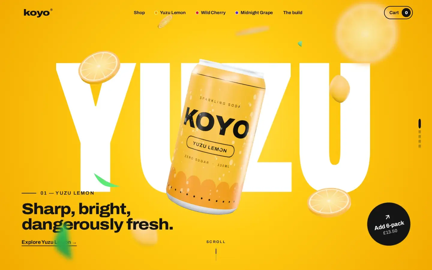
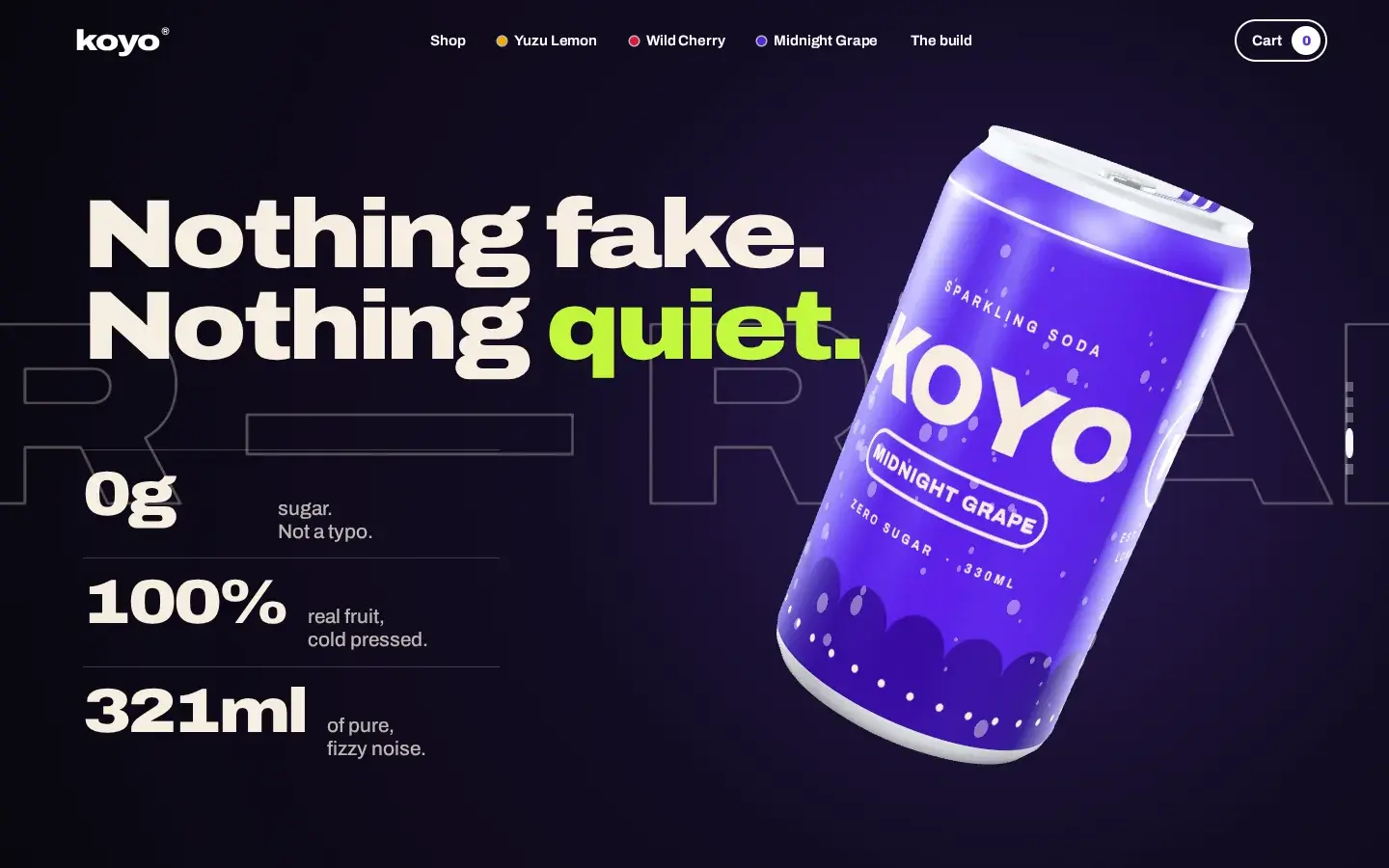
Twenty-four seconds, straight off the site: the can turning in the dark, the colour wipes from yuzu to cherry to grape, and the line-up landing on cream. The footage is the real site being scrolled - no video behind the cans, no AI, just code.
A Brand From
a Blank Page.
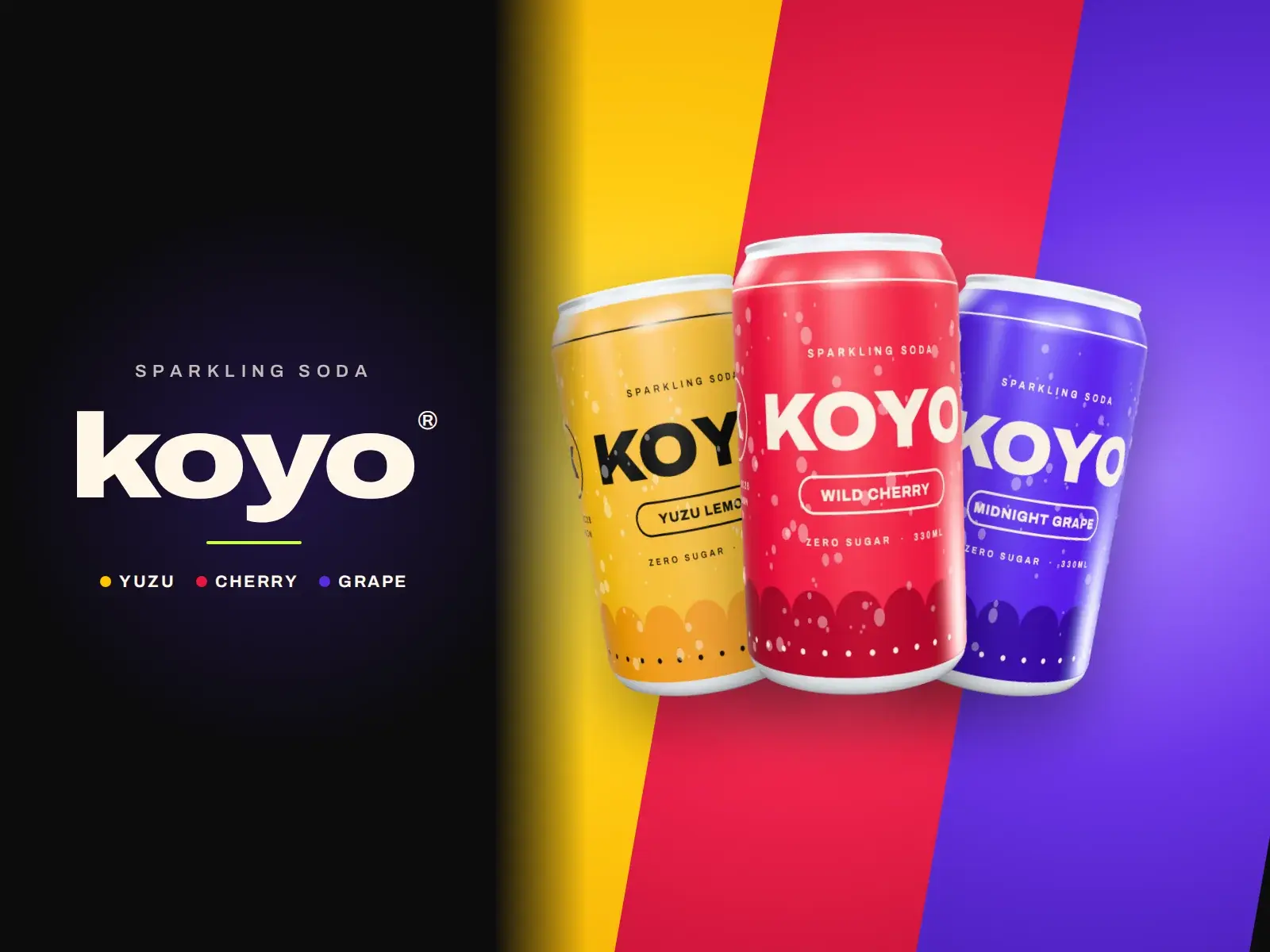
KOYO is an agency showcase build: we invented the brand ourselves to show what a product launch site can feel like when it's built properly. That meant doing the whole job - a name, a loud, playful voice, three flavours with a colour world each, a can design - and then a storefront where the product is the experience, from the first scroll to the order confirmation.
Name & Voice
Short, loud copy that sounds like the drink: "Sharp, bright, dangerously fresh."
Three Colour Worlds
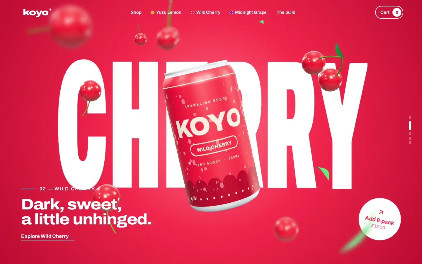
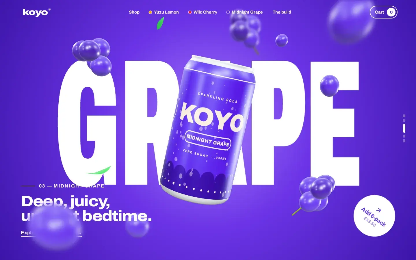
Yuzu yellow, cherry red and grape purple, each with its own gradient, fruit and giant word.
The Can
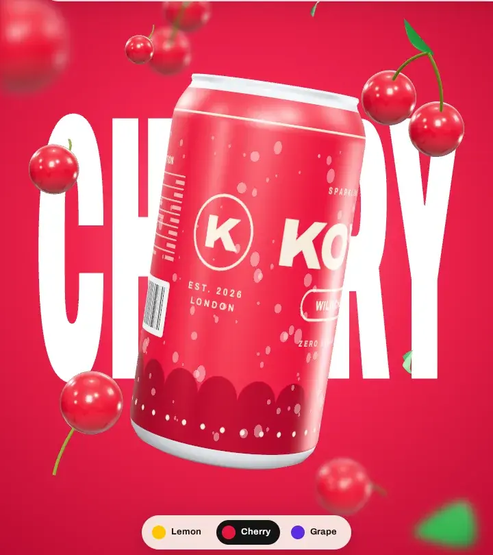
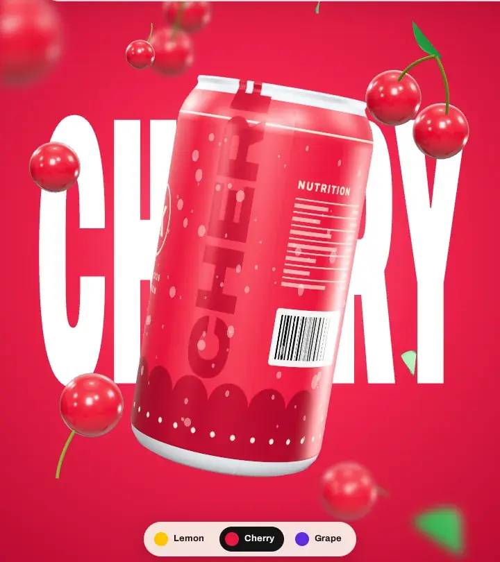
A full can wrap - front, sides and back - designed for the 3D model, not a flat mock-up.
One Typeface
Archivo's width axis, stretched from extra-condensed to expanded, carries the whole identity.
Your Scroll Is
the Play Button.
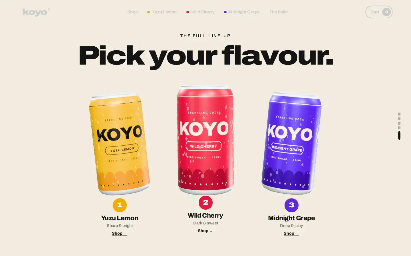
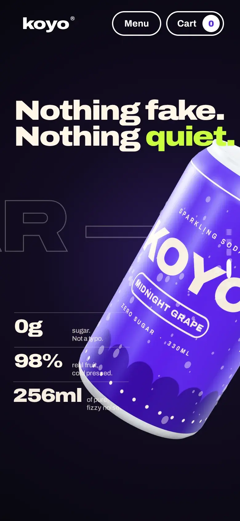
The home page opens on a pinned stage, five screens tall. As you scroll, one timeline runs from the yuzu can to the cherry, the grape, a close-up on what's inside and the full line-up. Nothing plays on its own: scroll slowly and it moves slowly, scroll back and it rewinds - at the same pace on a phone, a tablet or a widescreen.
How the timeline works
One Number Drives Everything
Scroll position becomes a single progress value from 0 to 4. Every can angle, light, colour and line of copy is a pure function of that number and the clock, so any point in the story can be reached from any other.
Eased, Never Jumpy
Progress follows your scroll through a time-based easing filter, so a flick of a trackpad or a jerky phone swipe still turns into one smooth move.
Colour That Wipes, Not Fades
Each flavour floods in as a growing circle, while the can itself is cut by a diagonal clipping plane - the yuzu can becomes the cherry can in one sweep.
Type With Moving Parts
The giant flavour word is drawn one canvas per letter, so each letter can rise and fall on its own; the headlines slide up out of masks, and the stats count up as you scroll.
Not a Video.
A Can, Built in Code.
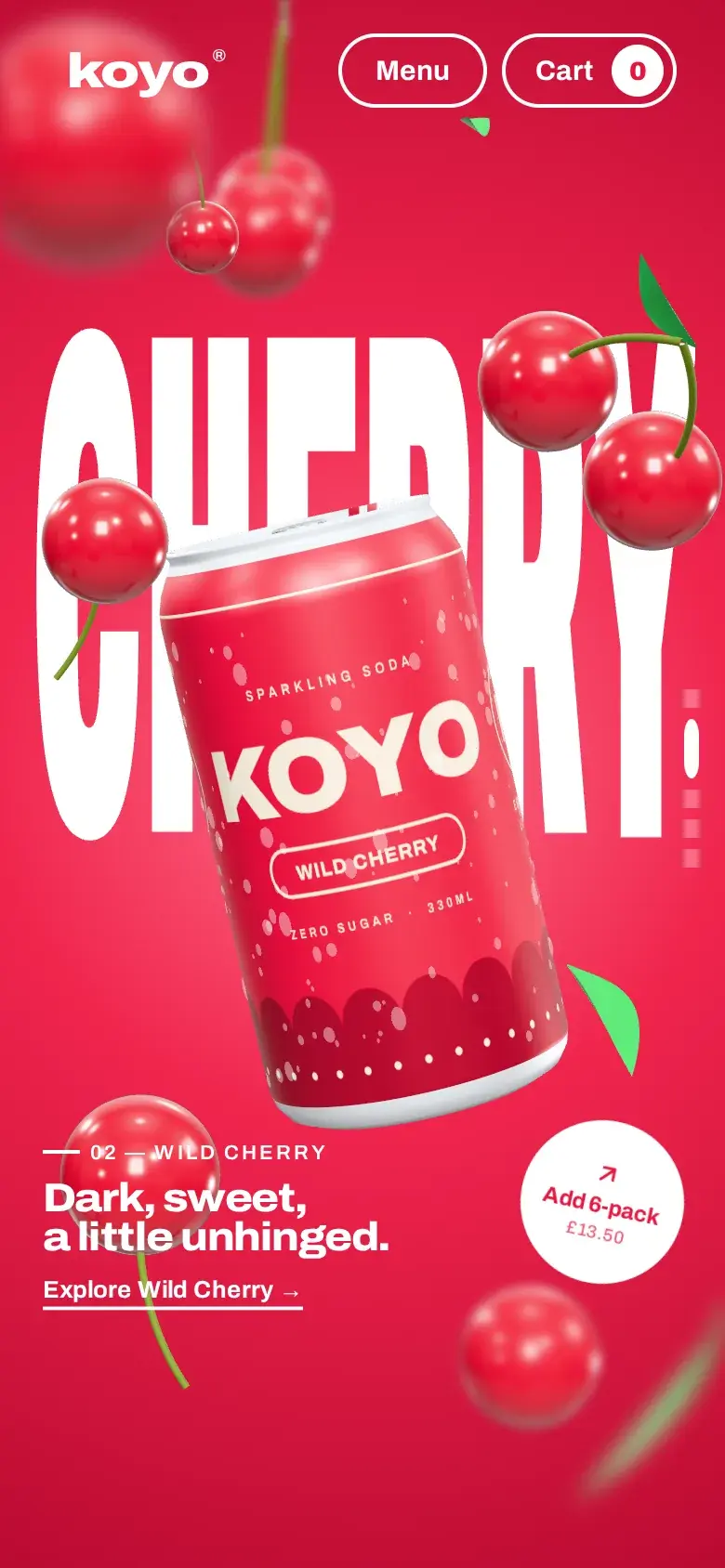
There are no image sequences behind the story. The can, the fruit and the lighting are built in three.js and rendered in real time, frame by frame, on the visitor's own device - which is why it can respond to the scroll, to the cursor and to a drag.
Turned Like a Real Can
The body is spun from a 19-point profile at 128 segments - rim, neck and the domed base included - with a ring-pull and rivet in brushed aluminium.
A Label Painted at Load
Each wrap is drawn onto a 2048 × 1024 canvas in the site's own typeface when the page opens, so the KOYO on the can is the same Archivo as the headlines.
240 Drops of Condensation
Every can carries 240 glassy droplets, drawn in a single instanced call, under a clear-coated metallic finish lit by a studio environment and four lights.
Fruit Made of Maths
Lemon slices with painted segments, glossy cherries on curved stems, grapes with a velvety sheen - all modelled in code, so there's nothing to download.
 Front
 Side
 Back
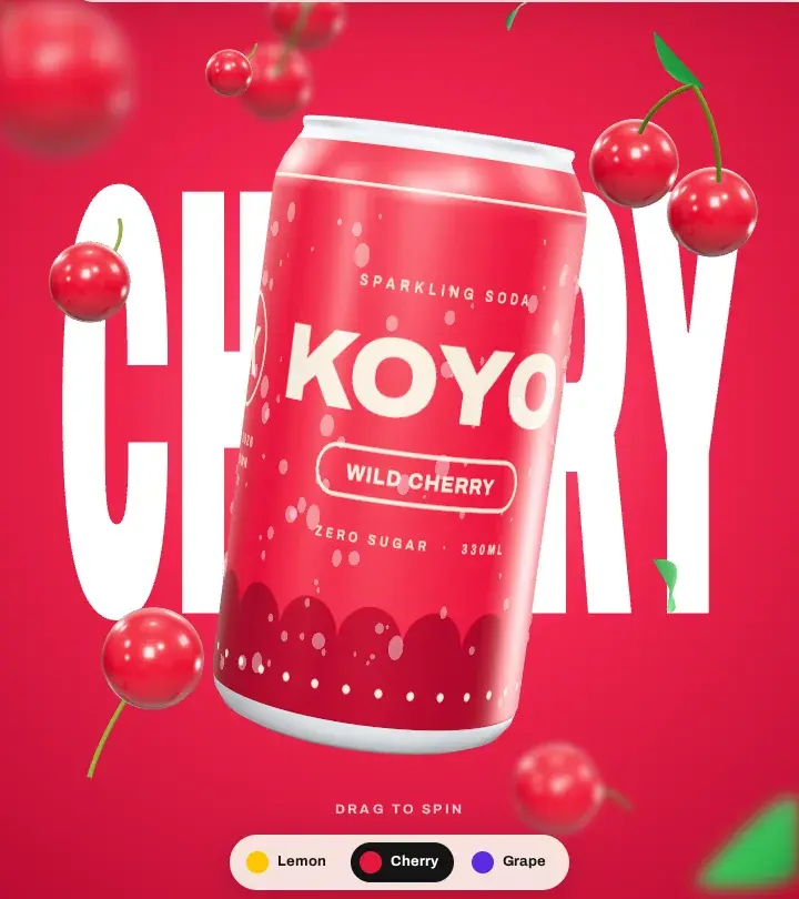
One live can, dragged round on the product page - the whole wrap is designed, not just the front.
Cinematic,
On a Phone.
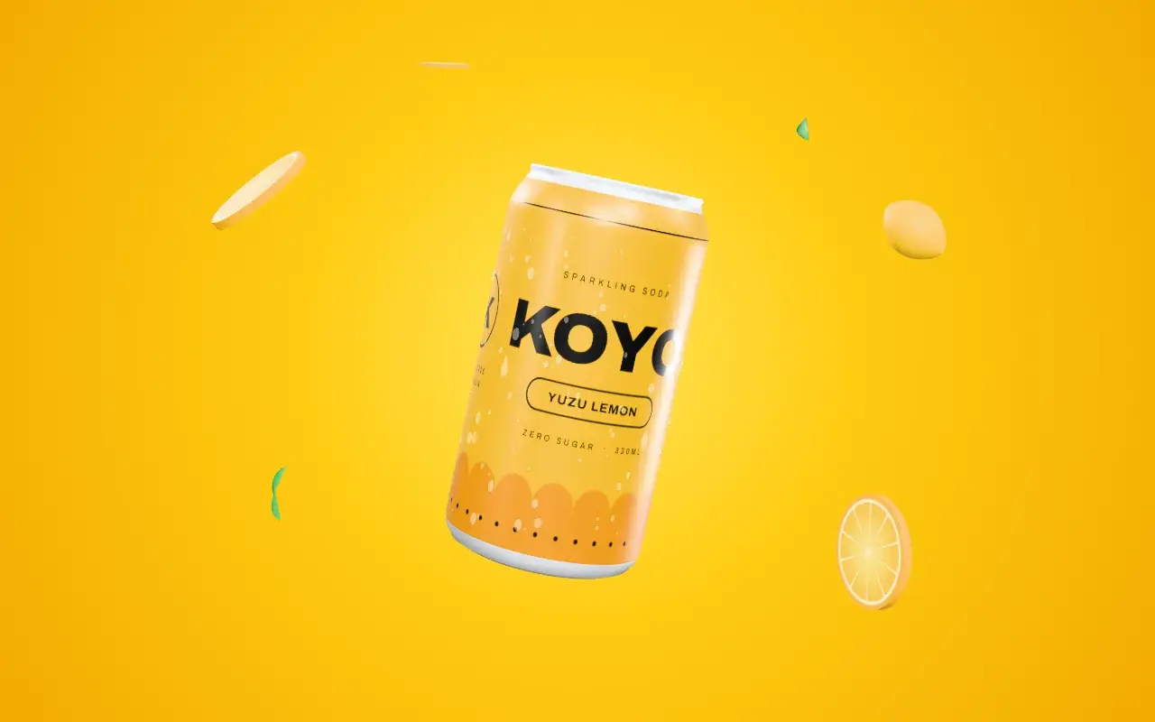
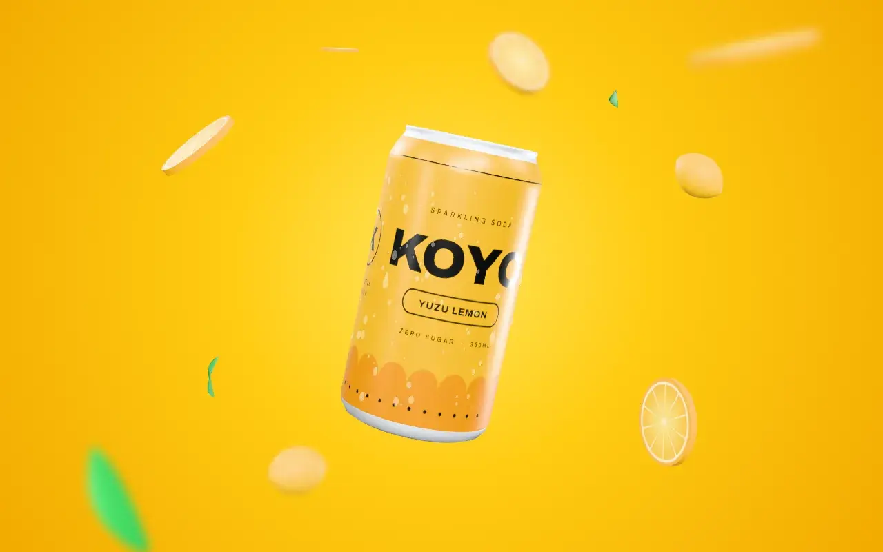
Real depth of field is expensive. Instead the scene is drawn in three layers: fruit behind the can and fruit in front of it are rendered at half resolution and softly blurred, while the can stays pin-sharp in the middle. It reads like a camera lens, and costs a fraction of the real thing.


A Fixed Pixel Budget
The renderer caps itself at about 2.8 megapixels, so a 4K monitor and a phone do similar work - and both hold their frame rate.
Idle When Unseen
Scroll past the story or switch tabs and rendering stops; empty layers are skipped entirely rather than drawn blank.
Nothing to Install
No framework and no build step: three.js and the Archivo variable font are vendored, the font is preloaded, and the pages load as plain ES modules.
Then It
Gets Down to Business.
After the show, a proper shop. Product cards on the flavour gradients - with the cans rendered from the same 3D scene - pack sizes and an add-to-cart that never leaves the page, a ticker of what's in the can, and a page footer that signs off in the brand's own giant type.

Go On,
Give It a Spin.
Each flavour has its own page, built from one template. The can rises into a sticky 3D viewer on the flavour's gradient: drag it and it spins with momentum, move the cursor and the fruit drifts with parallax, and change the pack size and it gives a little twirl.
Spin the can yourself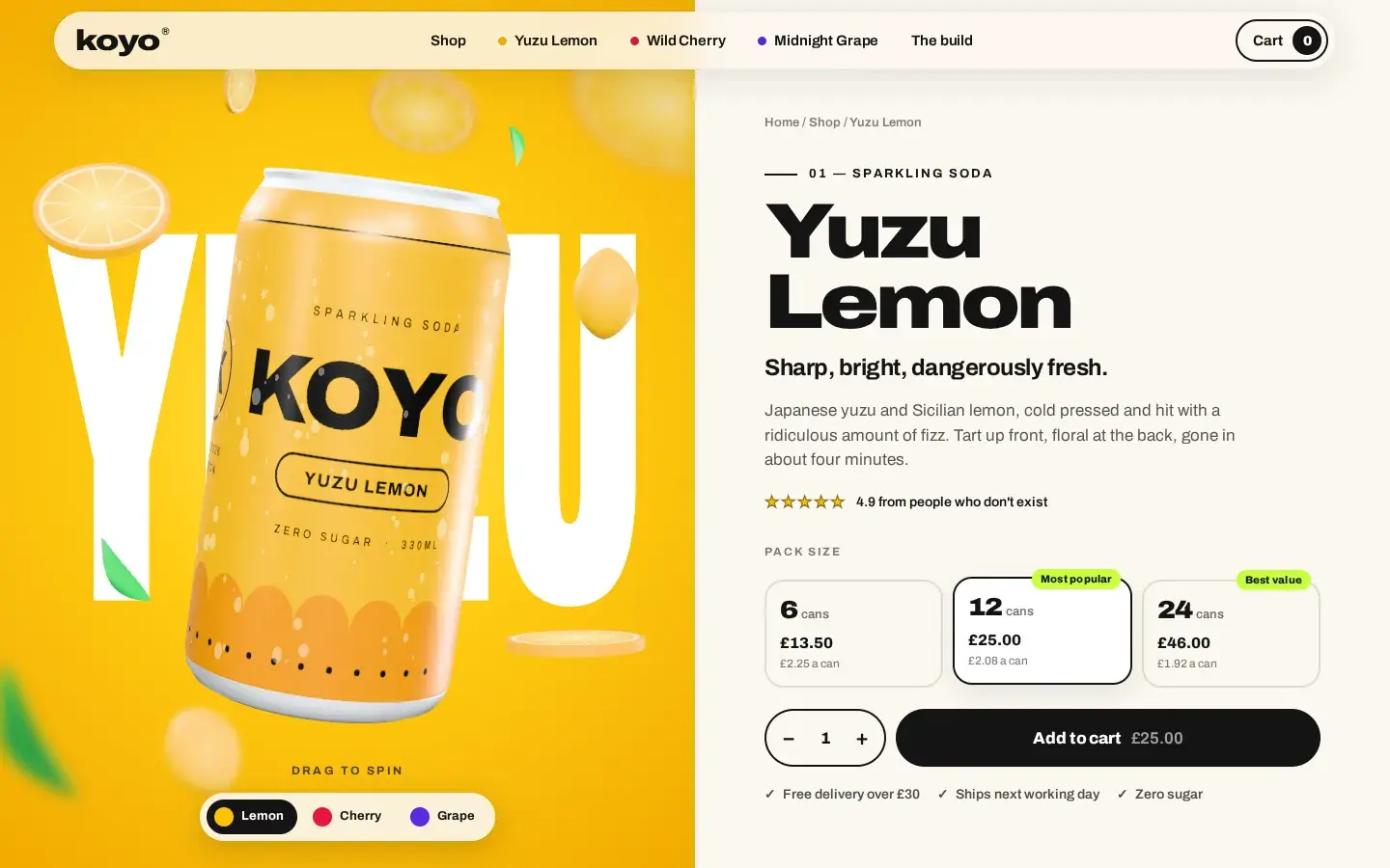
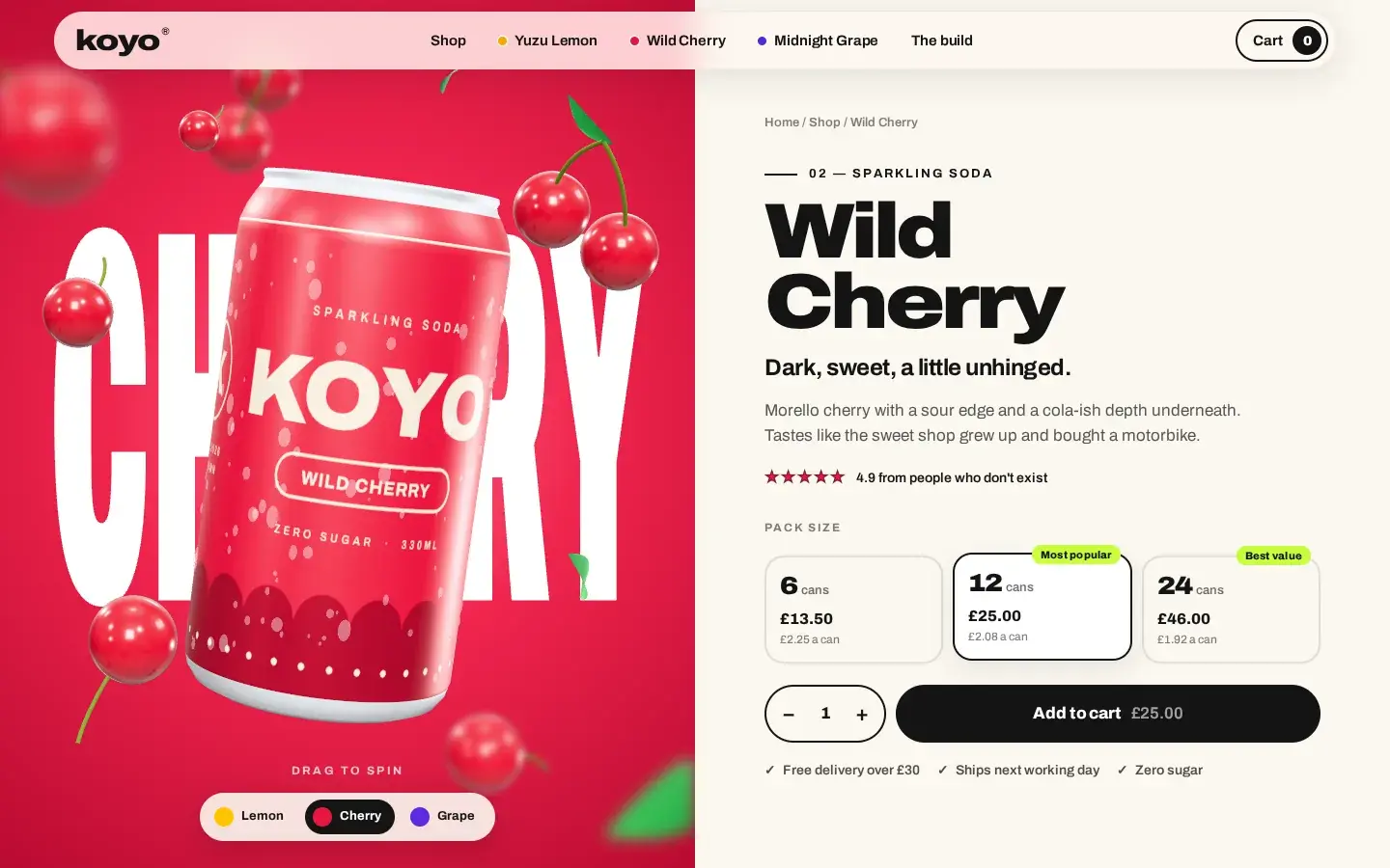
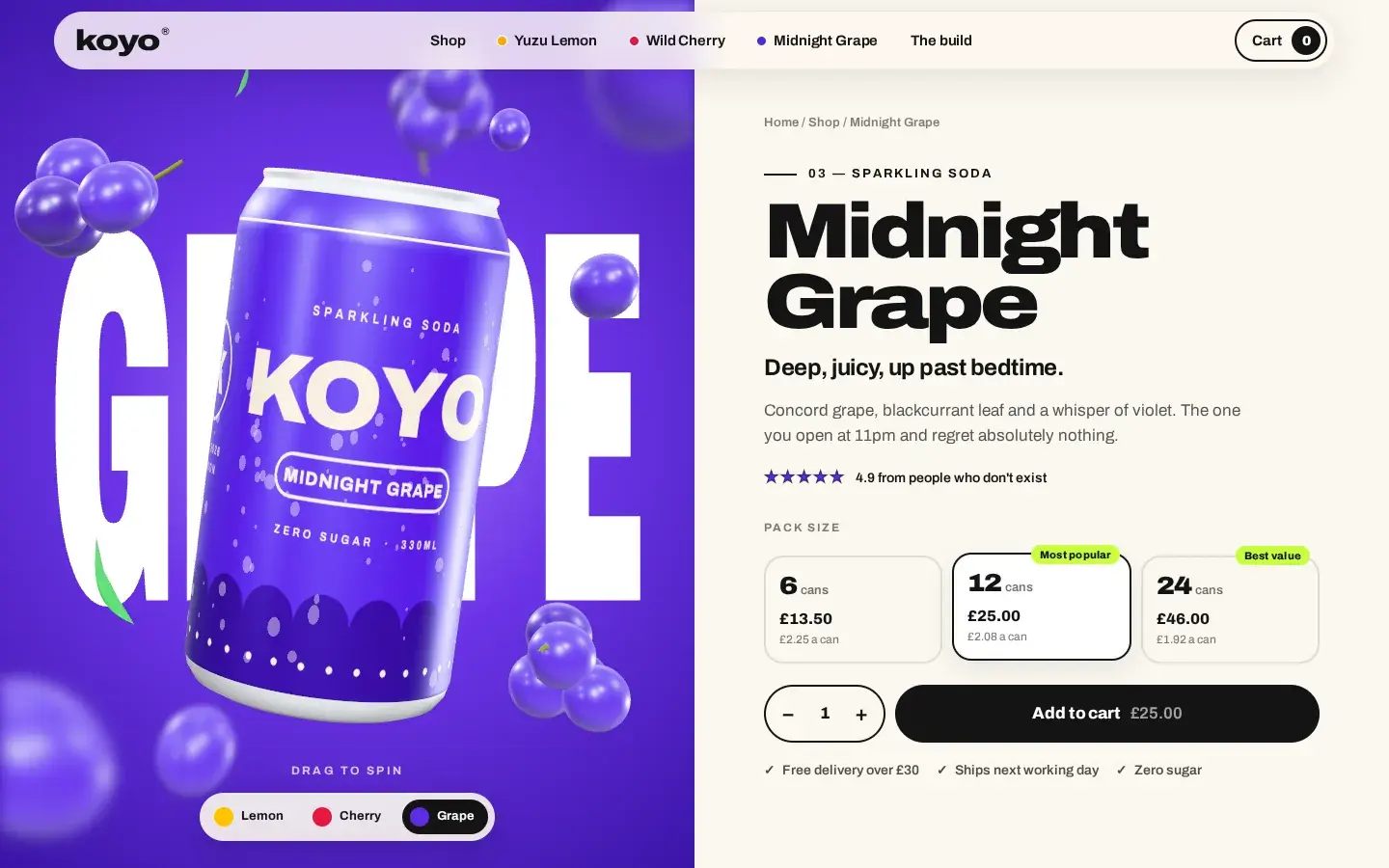
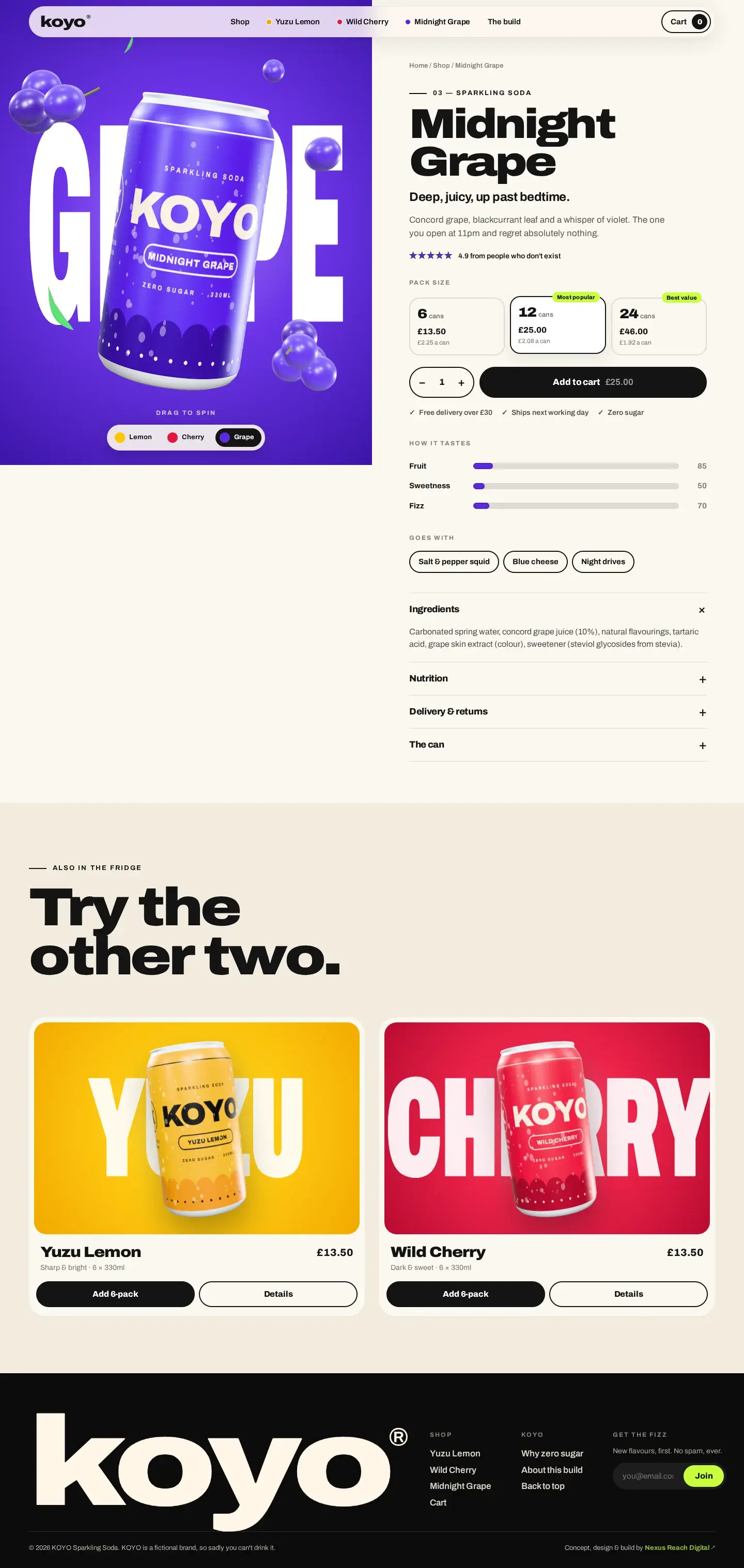

Drag, Flick, Let Go
Pointer events feed a velocity that decays naturally, so a flick keeps the can turning and a slow drag turns it slowly - with the mouse or a thumb.
Packs That Do the Maths
6, 12 or 24 cans, each with its price per can, a quantity stepper and a live total on the button.
Pages That Glide
Cross-document view transitions make moving between flavours feel like one app, with no client-side router.
A Shop That
Actually Works.
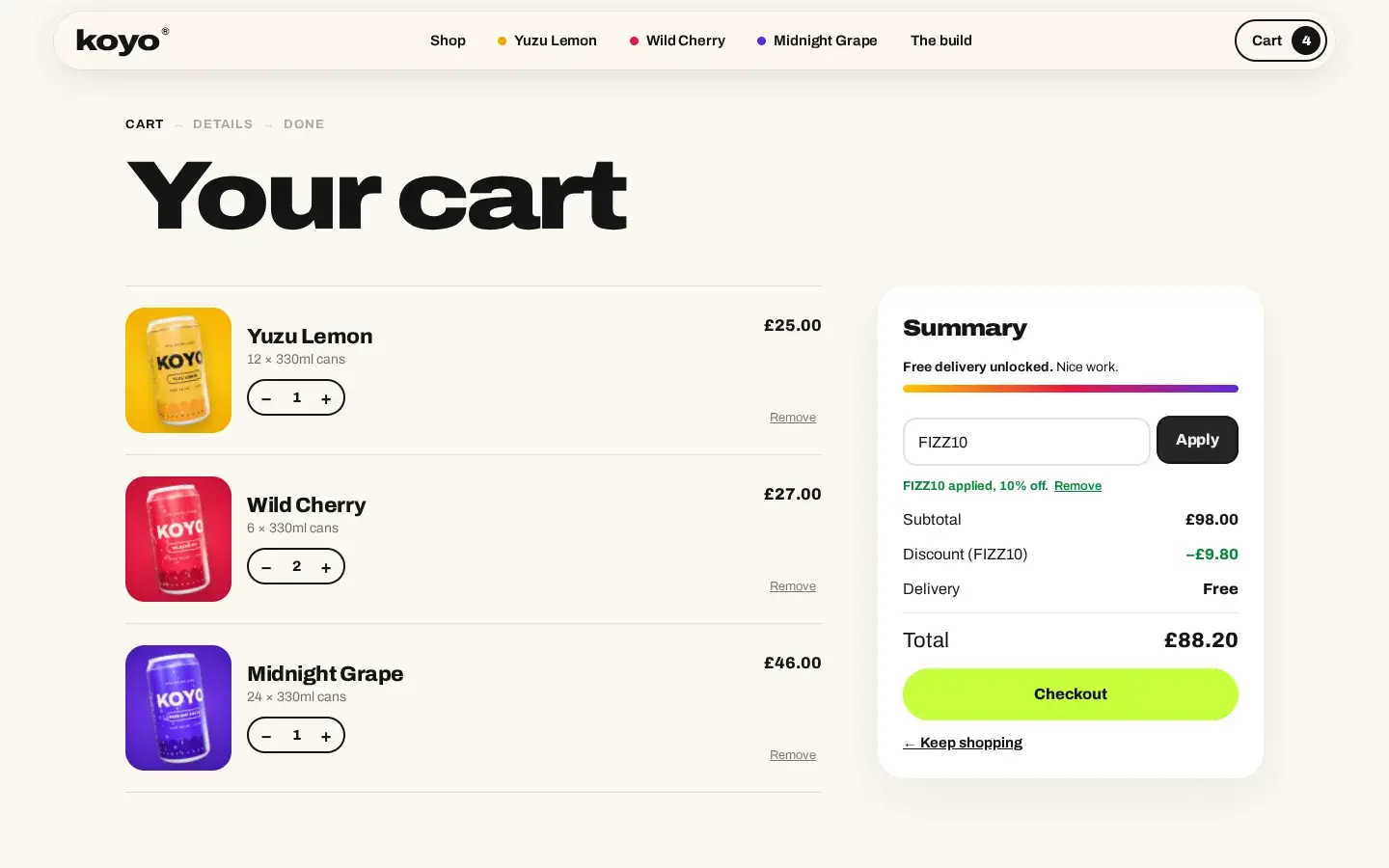
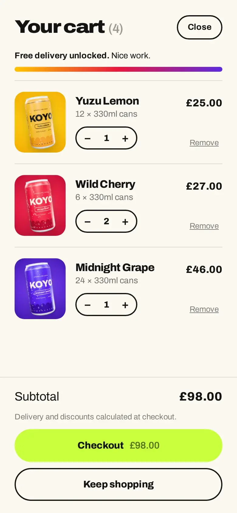
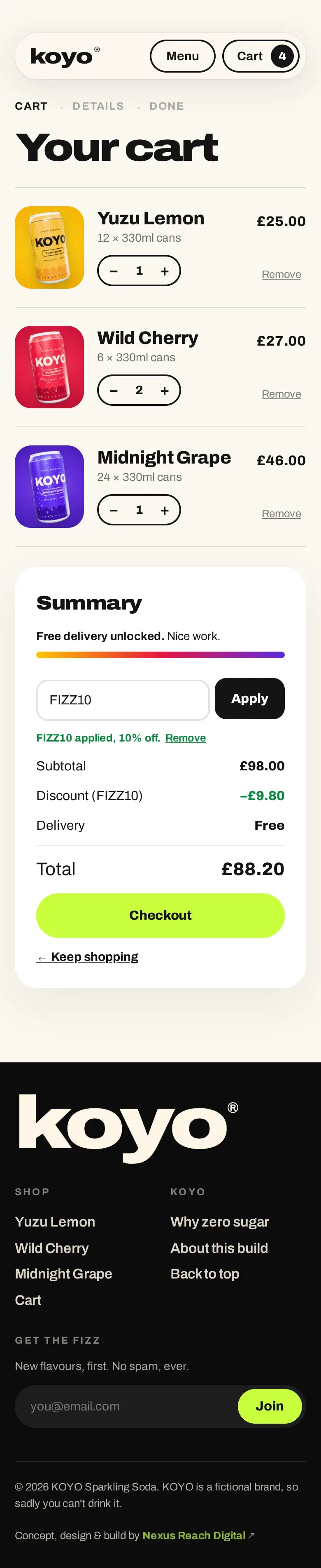
Under the spectacle is a complete store flow: a slide-out cart from any page, a cart page with promo codes and delivery options, and a three-step checkout that ends in a confirmation. Payment is the one part left as a clearly marked demo - the spot where Shopify, Stripe or Apple Pay plugs in for a real brand.
A Cart That Remembers
It persists between visits and stays in sync across open tabs, with every line checked against the catalogue when it loads.
Free Delivery, Made Visible
A progress bar in the flavour colours shows how far you are from free delivery, in the drawer and on the cart page.
Codes and Delivery Options
Promo codes apply instantly, standard or next-day delivery updates the total, and anything typed survives a re-render.

The
Verdict.
KOYO shows what happens when a product site is treated as the product's first impression rather than a catalogue. The brand, the cans and the 3D were designed together, so the story, the shop and the checkout all feel like the same loud, fizzy thing.
It's also proof that this level of motion doesn't have to mean a heavy site: no framework, no video files, a fixed rendering budget - and a store underneath that's ready to be wired to a real catalogue and checkout.
Your brand could scroll like this.
Launching a product, or tired of a site that just sits there? We'll design and build a storefront people remember - motion, 3D and all - and make it fast on a phone.
Start Your Project